今日は積み上げグラフを描いてみます。メタゲノム解析で検出された細菌種を示すときとかに使われるのを見ますね。データはAirPassengersという既存のデータセットを使います。
このAirPassengersデータは時系列データセットというものらしく、初めて見たんですがぱっと見ベクトルっぽい感じでした。1949年1月から1960年12月までの飛行機の乗客数が並んでいます。
| Jan | Feb | Mar | Apr | May | Jun | Jul | Aug | … | |
| 1949 | 112 | 118 | 132 | 129 | 121 | 135 | 148 | 148 | 136 |
| 1950 | 115 | 126 | 141 | 135 | 125 | 149 | 170 | 170 | 158 |
| 1951 | 145 | 150 | 178 | 163 | 172 | 178 | 199 | 199 | 184 |
| 1952 | 171 | 180 | 193 | 181 | 183 | 218 | 230 | 242 | 209 |
| … | 196 | 196 | 236 | 235 | 229 | 243 | 264 | 272 | 237 |
というわけでまずこれをdataframeに変換したのち、3ヶ月ごとに一つの季節にまとめます。続いて処理を簡単にするため縦長データに変換します。
data.ap <- t(matrix(AirPassengers,ncol=12))
data.ap.season <- data.frame(year=seq(1949,1960),
                             winter=rowSums(data.ap[,c(1:2,12)]),
                             spring=rowSums(data.ap[,3:5]),
                             summer=rowSums(data.ap[,6:8]),
                             autumn=rowSums(data.ap[,9:11]))
data.ap.season.long <- pivot_longer(data.ap.season,
                                    colnames(data.ap.season)[-1],
                                    names_to = "season",
                                    values_to = "customers")
でこうなります
| year | season | customers |
| 1949 | winter | 348 |
| 1949 | spring | 382 |
| 1949 | summer | 431 |
| 1949 | autumn | 359 |
| 1950 | winter | 381 |
| 1950 | spring | 401 |
| 1950 | summer | 489 |
| 1950 | autumn | 405 |
| 1951 | winter | 461 |
| 1951 | spring | 513 |
| 1951 | summer | 576 |
それでは各年の季節ごとの乗客数を積み上げ棒グラフにしてみましょう。
g <- ggplot(data.ap.season.long,aes(x=year,y=customers,fill=season))+
  theme_base()+
  geom_bar(stat = "identity")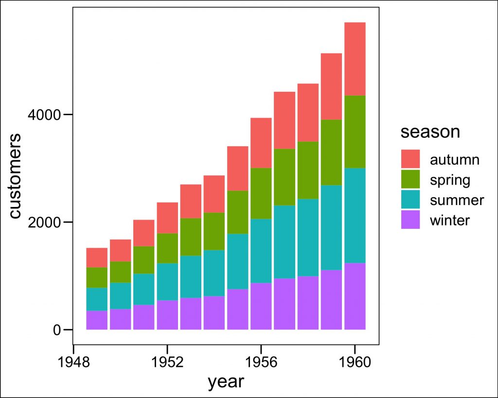
積み上げ長を統一して割合を比較しやすくするには、geom_bar内のpositionを”fill”に指定します。
g <- ggplot(data.ap.season.long,aes(x=year,y=customers,fill=season))+
  theme_base()+
  geom_bar(stat = "identity",position = "fill")
ggsave("fig/1208_2.jpeg",g,width = 15,height = 12,units = "cm")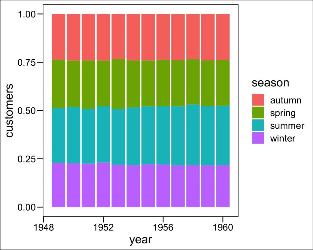
特に言いたいこともないので今日は終わりです。